A Sophisticated and Family Friendly Home
Aug 21, 2019 | Carpet One Floor & Home
There is something to be said about having an elegant grown-up home that’s also kid-friendly. It’s always been my goal to have my children learn to live around nicer objects and understand the value of a well-decorated home. It’s how I grew up, so I know it’s possible. It’s tempting to wait until the kids are older, but why not teach them to respect personal belongings while also having a beautiful backdrop for memories to be made? Having a sophisticated home that functions for your growing family is achievable. So many of the homes that we design are for young and growing families, and this home is no exception. In developing the design for this four-bedroom family home, I truly wanted it to be sophisticated but functional. With a little extra thought and creative planning, it could be done. Following are some key design tips to creating a cohesive, functional family-friendly home.
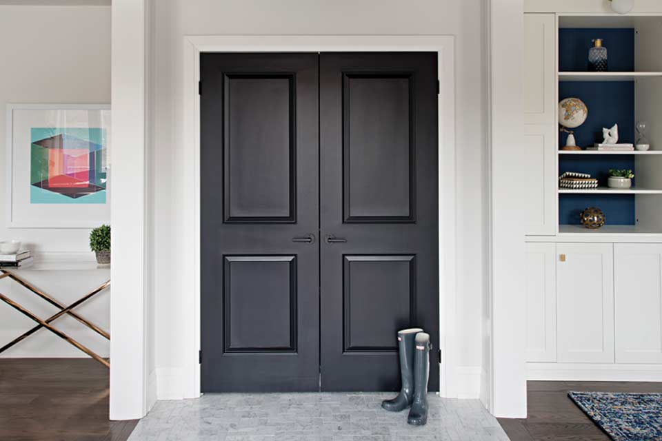
Start by considering how you actually, rather than should, use the space.
Start by rethinking the purpose of the rooms in your house, and change them up to suit your everyday living. Planning the space in your home can be a struggle. Start by considering how you actually, rather than should, use the space. These two perceptions can be vastly different. With careful observation and a little thinking outside the box, you can redo a layout so that it fits your modern lifestyle. I continually remind my clients that how they think a room should function is not always the most efficient way for it to function.
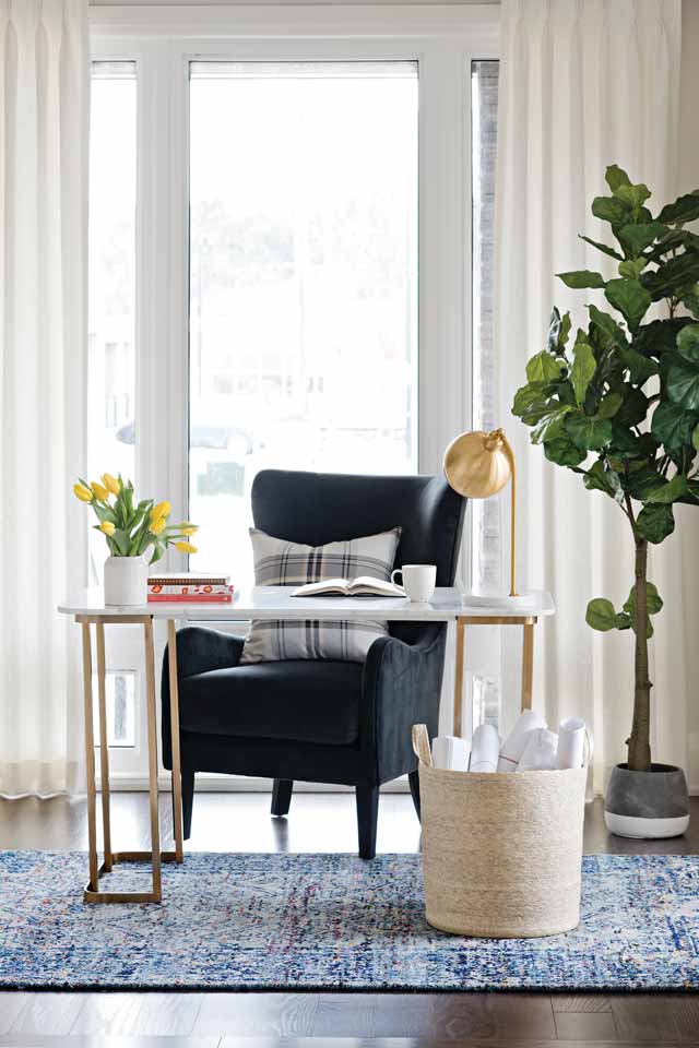
The longer you live in a space, the less you see its flaws and how it may not be functioning as well as it could for your family.
The longer you live in a space, the less you see its flaws and how it may not be functioning as well as it could for your family. As a designer, I often consider changing out the purpose of a room to suit my clients’ lifestyle. That’s exactly what we did for this bright and airy Lindvest home located in the Aurora Glen community. The community is north of the city in the heart of green trees about a stone’s throw from modern conveniences, a perfect place for a young professional family to put down roots. It provides an easy commute to the big city but with loads of space to grow. The home needed to function for the modern-day couple with kids.
In this house, we swapped out the traditional living room at the front of the house for a home office with custom built-in shelves. Many modern families no longer have the need for a formal sitting area, and, although it’s nice to look at, it’s not practical. We added some extra personality by cladding the backs of the shelves in a rich navy grasscloth wallpaper to add depth. The cabinets below can hide toys or board games for occasional playtimes as well. This small, sunny zone is now a convenient place to sit back and read a book or squeeze in a conference call to the office. Another great example of repurposing a room is the area that was intended to be the formal dining area. We converted into an open space for entertaining instead. A great eating nook already existed, adjacent to the kitchen, where the family enjoyed all their meals together, as well as island stools. So the dining room felt redundant for a young modern family. The grand piano steals the show. Just because the room isn’t being used the way the builder intended it to be used doesn’t make it wrong. It makes it yours!
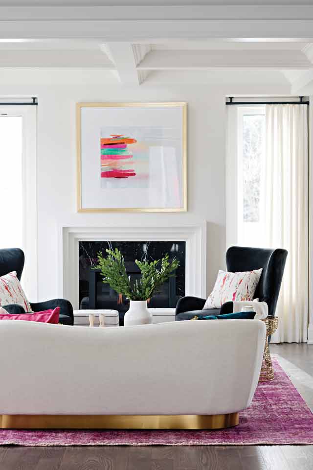
Just because the room isn’t being used the way the builder intended it to be used doesn’t make it wrong. It makes it yours!
It’s a modern age, and family homes need to adapt to the times, not only with open-concept layouts but also with style and furnishings. This is why I favor a mix of old and new. Get rid of your old stained college futon! Nobody wants to sleep on it anyway. But it doesn’t all have to be new and modern. Traditional and contemporary design elements when blended together create a friendly and inviting atmosphere without feeling like you robbed a big-box store. As a designer, my goal is always to create spaces that feel both modern and classic and are comfortable. In this home, we achieved that feel using contemporary fabrics and traditional architectural details, such as the crown molding. Family life calls for a home that is both fun and functional for social gatherings while offering quiet areas, such as the fireplace, to enjoy curling up with a book.
Sophisticated design is easy, but high-end design that is also practical can seem impossible. Just remember that family-friendly homes require flexibility. I always recommend going with a wipeable, washable, neutral paint, like Benjamin Moore’s AURA line. It has a lux matte finish that is also easy to wipe dirty fingerprints off of. Artwork also adds loads of personality to your home. It should evoke a mood but, more important, is how it makes you feel. Select art that speaks to your soul. We chose some playful pieces for this home, such as the Campbell’s Soup artwork.
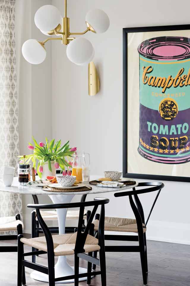
Other ways to add personality to your space are with unique lighting, fabrics, and wallcoverings. I adore vintage lighting or anything that starts a conversation. It’s a great way to elevate the look of any room. You can also splurge on lighting without worrying about kids’ sticky fingers because it’s usually far out of their reach! Having a little fun with color adds to the family-friendly vibe in this house. The fun and colorful pillow covers all have zippers so they are easily removed for washing.
Designer tip: Whenever you buy pillows, ensure that they have a zippered cover that’s removable. If they don’t have this, then don’t buy them!
A bright, bold area rug in the family room adds personality to the otherwise classic bones of this home. It’s a “second life” rug, which means it was a rug in its former life that was then dyed a rich shade of pink and now has a new, modern look. What’s great about these rugs is that they are incredibly durable and hide every bit of dust and fallen Cheerios. Wallcoverings add loads of personality and can be super playful, such as the one in this powder room. It’s a true gem, a hidden corner with playful cactus wallpaper and a sleek black faucet. It’s a fun little surprise waiting around the corner for guests.
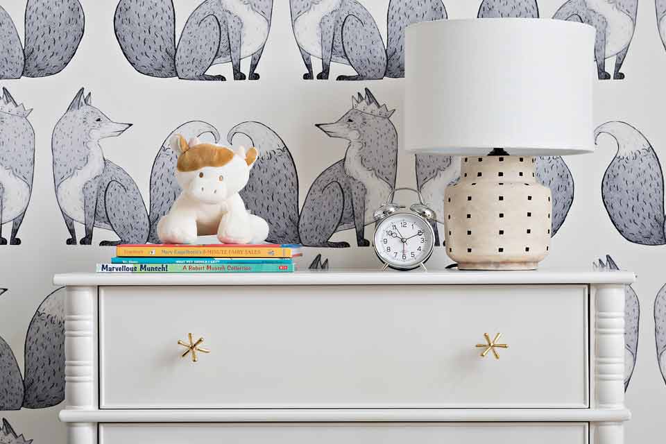
Bedrooms are a great opportunity to add personality and have a little fun. The nursery is playful with adorable fox-patterned wallpaper and modern furnishings with cute little accents. Also sporting fun wallpaper, the kids’ room has a unique “secret” closet/den where homework can be done and clothes can hang in the custom wall closet. Adding a sliding barn door to separate the two areas allows you to hide any teenage mess! Built-ins are a great way to improve functionality by creating dedicated storage. We design built-in cabinets and closets every chance we get. They elevate the look of the home while adding much-needed functional storage.
We design built-in cabinets and closets every chance we get. They elevate the look of the home while adding much-needed functional storage.
Sophistication all comes down to the details. Adding the coffered ceiling detail and large crown molding elevates the design. A soft palette in the kitchen with rich leathered granite counters and marble backsplash tile adds texture and warmth. The kitchen is the heart of the home and needs to function but also be interesting to look at. We decided to add a glass cabinet for display items with easy access to cookbooks. The wallpaper backing is a whimsical and subtle touch. We used a trending matte black with soft grays contrasting with warm brass.
Always consider the material and finishes in your home as well. Upgrading builder finishes truly elevates what would otherwise be a simple house. Throughout this home, the traditional-style interior doors are painted a rich, contemporary black and have sleek door handles to match. The engineered oak hardwood flooring throughout the main floor balances with the natural marble mosaic tiles in the entry and powder room.
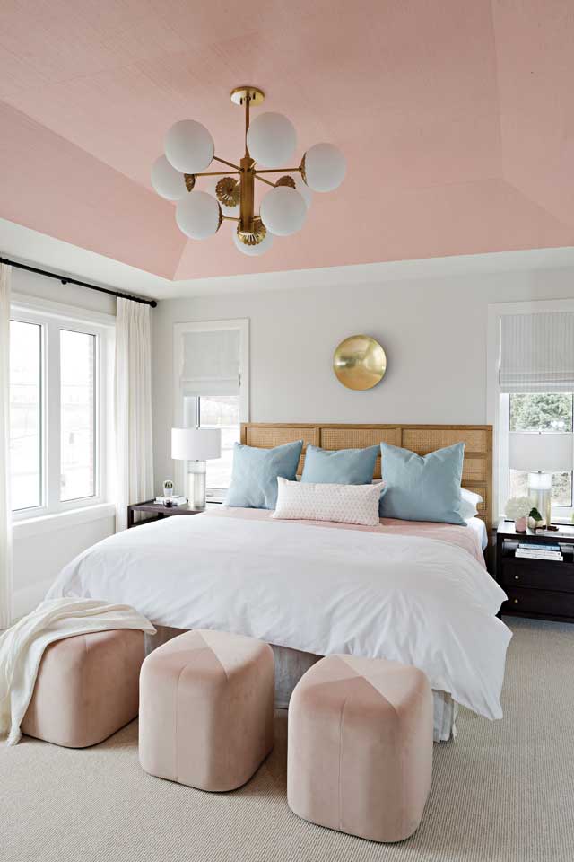
Wallcoverings can be used in nontraditional ways too. In this master bedroom, we created a true jewel by adding textured grasscloth wallpaper to the tray ceiling. It’s a bright and spacious corner bedroom leading to a large en suite complete with soaker tub, curbless glass shower, and double vanity. We chose to up the wow factor here by adding gorgeous large-format tiles to all the walls. The soft grays match perfectly with the marble mosaic floor tile and gray stone countertop. The cool gray tones contrast beautifully with the brass faucets and fixtures. A stunning modern chandelier hangs above the tub, adding extra sparkle.
Think beyond the traditional uses for rooms, and live your life through design that suits how you wish to truly live every day.
Rebecca Hay is the Principal of Rebecca Hay Designs. Rebecca is known and celebrated for her work and appearances on various acclaimed HGTV shows. With a focus on quality and craftsmanship, Rebecca and her team design beautiful, functional spaces, creating a signature blend of traditional and contemporary design. @RebeccaHayDesigns