Achieving an Elevated Look Designing With White
Mar 03, 2022 | Carpet One Floor & Home
There is something innately elegant about the color white. An all-white outfit, a winter wonderland tablescape, or a whitewashed living room looks somehow...elevated. White is not just a color (well, technically it’s not a color at all—more on that later!), but it’s also the predominant palette for many minimalist and monochromatic interiors, and there are a few good reasons why it has remained the simple and steady go-to choice through the decades.
A white color palette is not only timeless, it is also versatile. It can make a space feel bigger, brighter, and cleaner—benefits that I’ve leveraged in many of my own interior designs. But there’s a strategy to achieving the simplicity of an all-white interior. Here are some thought-starters and tips for making the most of this minimal color palette.
The Color of White
True white isn’t a color, per se. Black and white are shades, and only when you start adding pigments to them do they become colors. However, black and white function as colors. They augment colors by making them lighter or darker, and when used in their true form, black and white evoke emotions as any color does.
The whites we know come in a full range of hues—a rainbow of warm whites with yellow or pink undertones and cool whites with hints of blue, purple, or gray. We call this the “clarity” of white. This is important when choosing the right white for your space. Against a true-white backdrop, an off-white with gray undertones can appear “muddy.” An example of this is Benjamin Moore’s Intense White OC-51, which some might argue is actually gray compared to White Opulence OC-69, which is bright and crisp.
To avoid an all-out white war in your space, limit your selections and pay attention to color temperature. Every color has either warm or cool tones, including white. If you’re using warm white on your walls, ensure all the accompanying whites within the space lean to this side of the spectrum as well. Otherwise, a cool white selection may look blueish. Get samples and compare them side by side, in natural light, in the room where they will live. View these swatches at various times of the day to see them in different lights.
Tip: If you have another prominent color within the room, such as an accent wall or a rug that covers the entire floor surface, keep in mind that white with gray undertones will adopt some of that hue. This applies to exposures of the room as well!
Adding Interest without Color
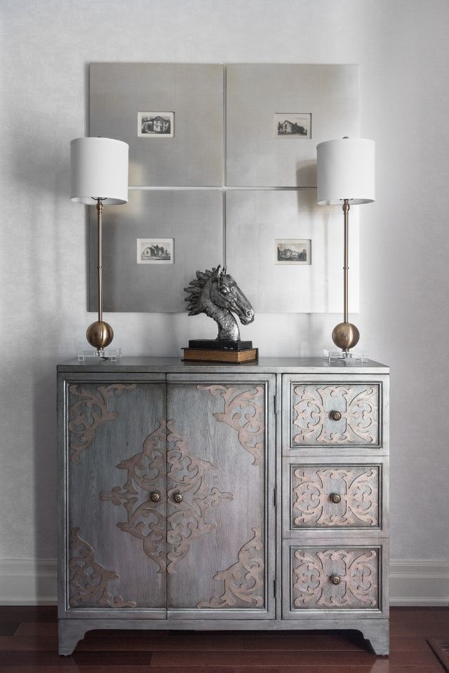
Texture is an important factor that impacts how “white” renders within your space. Even if two whites are the exact same color value, a high-gloss version will appear dramatically different than a matte, flat finish on the same surface. This applies to paint, wallpaper, tile, and even fabric—for example, white silk versus linen. The subtle textures of distinct materials create differences in the appearance of white.
If you’ve decided on an all-white space, you’ll quickly learn that you’re quite limited in your color choices. In the case of this minimalist palette, you could run the risk of a flat space that lacks dimension and interest. In the absence of color, I incorporate a variety of finishes, sheens, and patterns using the 60–30–10 rule.
In the design world, we use something called the 60–30–10 rule to balance the proportions of our primary, secondary, and accent colors within the room. This same rule can apply to texture as well. Your dominant white is the largest-scale application, occupying about 60 percent of the space, such as walls in a flat or eggshell finish. Your secondary white accounts for 30 percent of the space and would likely feature a more prominent pattern or texture, such as a wallpapered feature wall and a rug. The remaining 10 percent is reserved for your accent white— for example, white pillows or upholstery featuring a bold pattern.
Tip: Organic materials such as wood, stone, glass, and metal are neutral enough that they won’t compromise your monochromatic aesthetic, but they will bring added interest and can act as a visual “highlighter” for focal points.
In Combination with Color
If all-white minimalism doesn’t quite do it for you, you can use your white backdrop to highlight colors, features, and finishes and make them really “pop.” In this case, you’re using contrast to achieve the desired look.
Principles Put into Practice
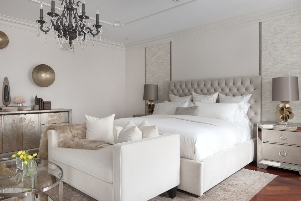
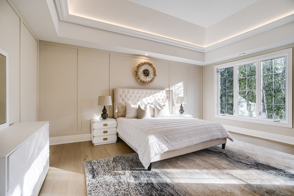
The bedroom at our Autumn Grove project began as a tired, borderline-boring bedroom and was transformed into a crisp and airy space. Our client wanted the room to have a hotel-like look and feel, so we leaned into a classic white-and-brass palette that plays with texture and subtle shades with gray undertones. We incorporated multiple relaxation zones throughout to visually divide this large, open space and offer areas to relax and rejuvenate.
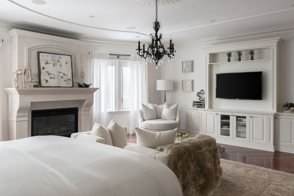
The design concept of the space was “Da Vinci’s studio,” so we incorporated vintage and artisan elements that highlighted the client’s heritage and background. White textured wallpaper was used on the walls to add shimmer and depth, with accent panels that portrayed old script. We also added a custom built-in, painted in Benjamin Moore’s White Dove, to house the television in front of a sitting area.
Fabrics play a key role in the overall ambiance of spaces such as bedrooms and living areas, where we like to cocoon. The bed sheets and the other fabrics and the other fabrics are all neutral white tones that complement each other—from the circular lounge chair in the corner, to the custom drapery, to the bedding and loveseat.
Some people have a logical but unnecessary fear of white upholstery. The thought of staining or “defacing” their brand-new sofa is enough to keep them up at night. If you have children or pets, perhaps put the white couch on hold until they grow out of their “sticky” stage. Even so, there are lots of user-friendly, washable, and stain-guarded fabrics on the market that are both practical and beautiful.
The white textiles really enhance this bedroom’s sense of serenity and lavish comfort, giving that “hotel” vibe that our client asked for.
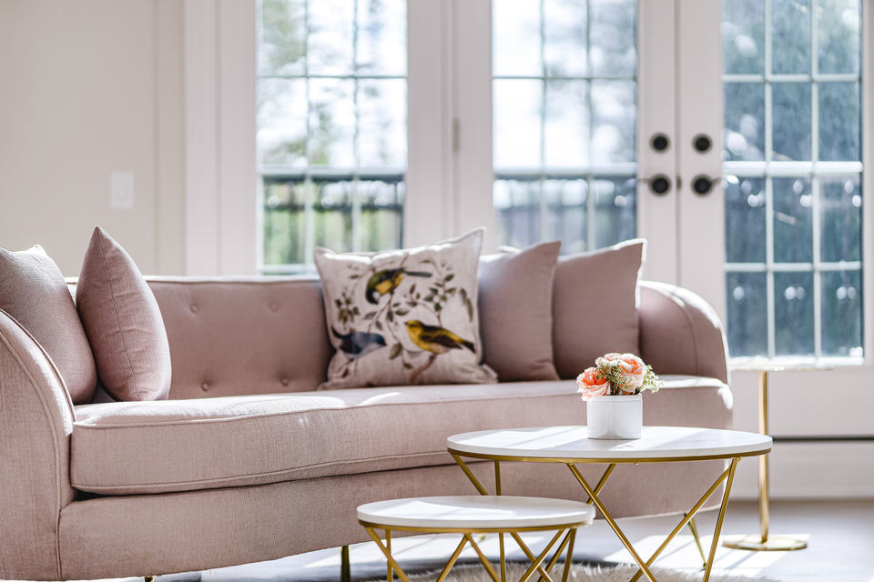
Lighting also brings depth and dimension to a room and can help soften the starkness of an all-white interior. In a bedroom, keep in mind the relaxing atmosphere that you hope to create and choose soft, warm light bulbs. If you’re unsure of where to add lighting, focus on the various “zones” within the space. This bedroom features multiple areas to kick back and relax, so we decorated each area with its own dedicated light source: a floor lamp in the sitting corner, bedside table lamps for reading, and a romantic chandelier over the bed for ambient lighting, featuring ornate details that complement the overall Da Vinci-inspired aesthetic. The lighting in this room acts as mini focal points to highlight each “zone”—and did you notice that none of the fixtures or lamps are white?
A common misconception is that white is basic, but the beauty of this hue truly is in the eye of the beholder. I perceive white as warm, welcoming, and luxurious, with an overarching elegance that sets the tone for the whole area. It creates the illusion of more space, light, and air—the holy trinity of beautiful homes. However, as with all interior design tools, an all-white color palette needs to be applied in a strategic and mindful way to ensure you’re using all those wonderful white attributes.
Design by DIANA ROSE Photography by MIKE CHAJECKI
Diana Rose Balanyuk is the head designer of Diana Rose Design. Her design is a journey of self-discovery, expression, and storytelling. Her love for traveling, architecture, culture, and color led her to interior design. Alongside her husband, Diana established Diana Rose Designs, which is known for luxurious interior designs that have an approachable, signature style that blends both modern and transitional aesthetics.