Behind The Design Living Space Cynthia
Aug 17, 2018 | Carpet One Floor & Home
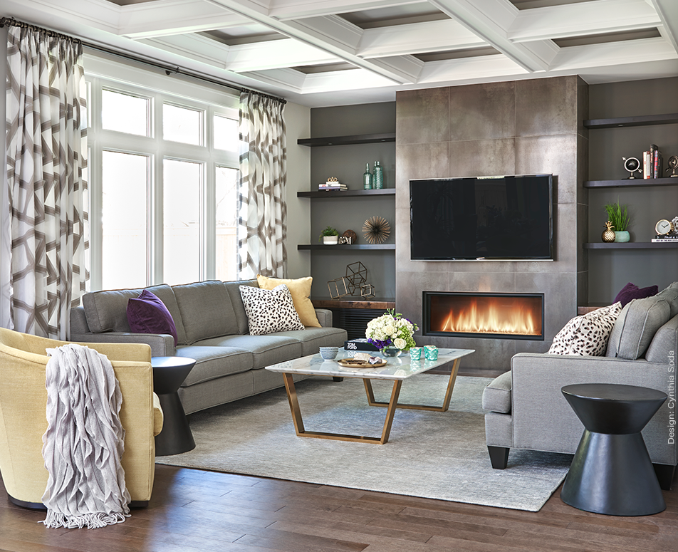
From the coffered ceiling to flagship fireplace, this stunning Cynthia Soda design was a sure fit for the cover of our 2017 fall issue of Beautiful Design Made Simple magazine. Now, we're disclosing all of the design details in an exclusive interview with Cynthia herself.

First things first. The stonework is breathtaking. Can you walk us through the selection and design process of this flagship fireplace?
The modern linear fireplace was something the clients really wanted in their new home. We chose a large format porcelain tile with some iridescence as its surround to create drama and add polish to the space. The depth of color and sheen in the tile also helps to maintain the focus on that elevation between the floating shelves and large TV above the fireplace.
Let’s talk supporting décor. What’s the secret to perfectly styled built-in shelving?
We chose a "less-is-more" approach to styling the shelves. Some pieces our clients already had, so once we took an inventory of what was existing we shopped for complementing pieces in finishes and textures that we wanted to accentuate in the space. For example, we have a lot of mixed metals throughout their main level, so we carried that story onto the shelves with some of the more sculptural pieces. We keep the shelving story personal with items our clients want to display, add some greenery and group items into smaller vignettes on each shelf. For us, the complementing and contrasting colors, textures and negative space around each grouping help showcase the items on display.
Tell us about the flooring. Species? Style? Stain?
The floor is a solid Yellow Birch Komodo. It's a medium grey-brown tone with little to no visible grain in a matte finish which helped set the tone for the rest of the finishes we used in the space. It has enough depth to ground the space, but it's matte finish and variegated tones make it easy to maintain.
The coffered ceiling is nothing short of spectacular. How does this feature change the look and feel of this space?
Thank you! I'm not a huge fan of pot lights everywhere so we like to explore different ways to light a space whenever possible. Our clients already wanted a waffle-style ceiling; we just didn't want to see the center of each square home to a pot light. We took it to the next level by creating a dropped ceiling cove light detail which adds an element of pattern and texture to the space. The soft glow of the dimmable overhead lighting allows our clients to control the amount of light in their space and the result feels elegant and warm. We wanted the focus to be on the quality of light in the room, not on the light fixture itself. Rarely do we look up in residential spaces, but in this space, there's a reason to take notice.
The marble and metal coffee table adds such elegance. What was your inspiration behind this piece?
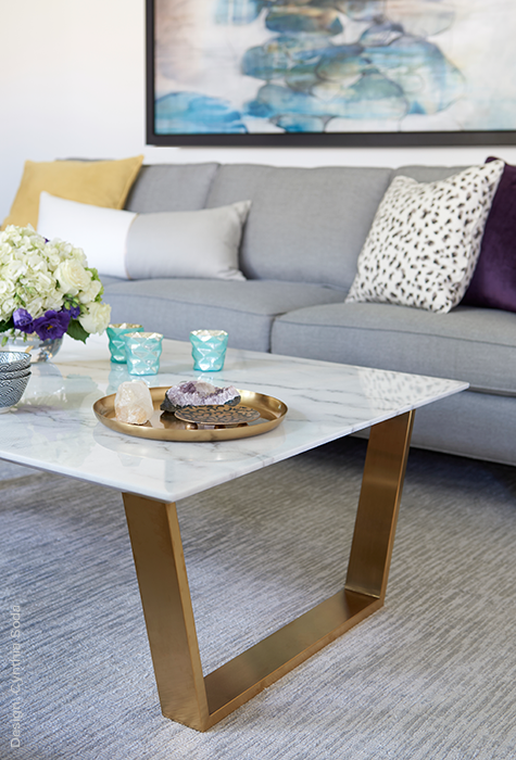
Once we finalized the main finishes (floors, walls, tiled areas etc.), we put together a vision board with pieces that had the patterns, textures and finishes we wanted to see in the space. We chose the white marble table with the brass-gold leg detail to carry the polished metal and white tones into the foreground of the living room. Even though it's a young family home, there's still room for elegance and the marble table adds that without stealing the show. If we had selected something with a wood top, the feeling in the room would be very different. The marble table sets the tone for the sophisticated-chic vibe we wanted to create.
We love the understated pops of color against the primarily dark backdrop. Can you speak to the overall goal for the palette of this space?
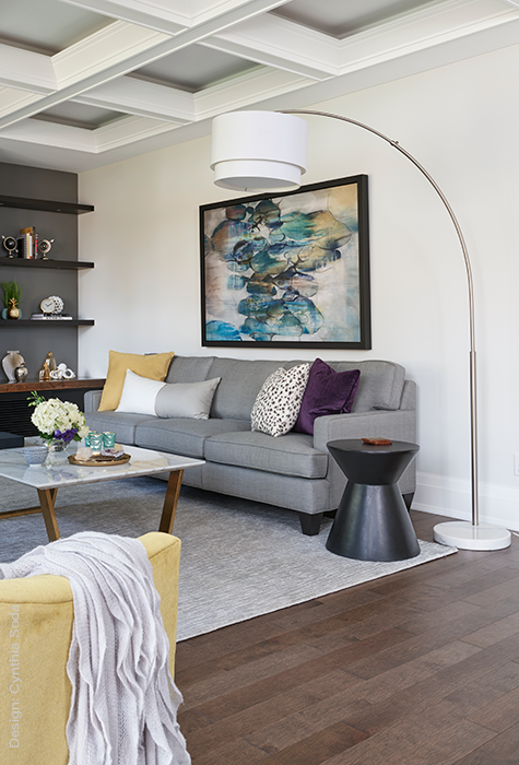
Our clients are fun loving and were open to our suggestions. Since it is a primarily dramatic backdrop, we kept the sofas and area rug light and neutral in order to play with jewel tones. The purple felt like a fun and natural suggestion since it complements the yellow tone of the chair and brass table legs. Even though we were going for sophisticated-chic, we wanted the room to feel approachable and light. The little pop of animal print is fun too and is a nod to the stools we had made across the way in the kitchen.
We simply love the drapery in this room. How did you approach this element and at what point during the design process?
We had the idea for the graphic drapery early on when we had selected the fabrics for the space. Our original fabric selection didn't fit the budget though, so we sourced an alternate option through our fabric suppliers to give us the same effect and meet our needs. We used a lined sheer with a high contrast pattern adding a dramatic frame to the large window overlooking the backyard. We ordered the drapery once the furniture was finalized so it all came together at once.
Last but certainly not least... Seating. If you could offer only one piece of advice for the ever-important selection of living room seating, what would it be and why?
You need to start off with a good plan. Consider the layout and flow of your room and adjacent spaces when you plan your seating arrangement. Since this living room is open to the eat-in kitchen area, we wanted to keep the layout easily approachable for entertaining and even incorporated a swivel chair as a connecting element between the two spaces. It's important to consider who will be using the space and what they will be doing there i.e.: watching TV, playing board games on the cocktail table, having conversations across the room, etc. Orienting two large sofas facing each other with a table between them creates a conversation zone, while chairs at one end create another. Scale and proportion play a huge role in the comfort and final selection of your furniture and as soon as you have a plan, you can select your pieces knowing they will contribute to a comfortable functioning space.
Cynthia Soda is the Principal Designer of Soda Pop Design Inc.
Soda Pop Design Inc. is a multi-disciplinary interior design firm providing complete custom renovation and design services for residential and commercial clients throughout the GTA. Soda Pop Design focuses on merging the client's lifestyle, personality and architecture to create customized livable luxury. @csodapop
Interior Design: Cynthia Soda | Photography: Stephani Buchman

