Color Your World Designer Interview
Aug 17, 2020 | Carpet One Floor & Home
 Q:
Q:
Adding color can be a daunting task for those designing their own spaces. How do you go about adding color without making a room feel overpowering?
A:
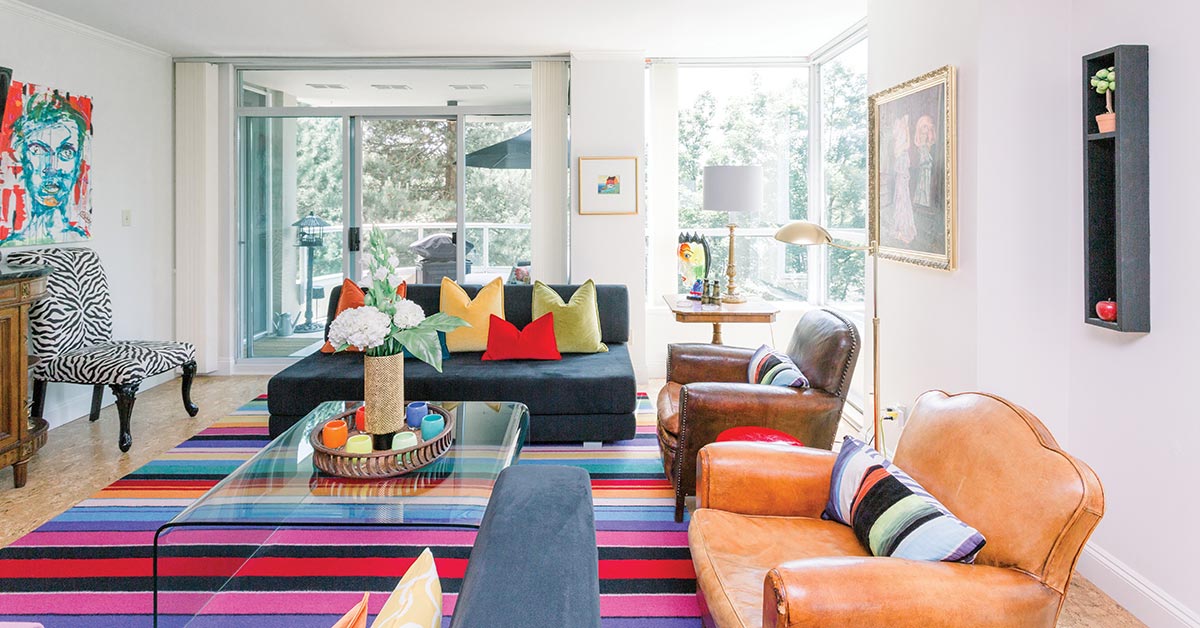
Color is one of the trickiest elements in any space, home, or design. With endless options in a variety of hues, tones, and textures, striking the right balance of color and intensity is the most integral element to any space. If done correctly, you can have a space beautifully accented through the use of color! First and foremost, find the balance. Where will your color be introduced? Typically, we suggest accents: furniture, rugs, pillows, art, and accessories. These are “noncommittal” items that will allow your space to transform through the seasons, trends, and years with you. This means that keeping a neutral palette in your base finishes, such as your floors, walls, and ceilings, will allow for the perfect base and canvas. So why not a white? Also, assessing your light is integral. Whether washed mostly with natural or artificial lighting, light will allow you the opportunity to assess how colors will be perceived.
Where ample flooding of natural light fills your space, you have leverage in also going bolder! Next, know your palette. It’s important to choose your tiers and tones and stick with them. Your base items and largest pieces should always reflect your base/grounding color. They don’t necessarily need to be in your darkest color, but rather they should provide the springboard for your accents to shine while also ensuring you stick within the same family of either warm or cool tones. Next, work your way up the tier. Begin to select your accent colors; limit them to two or three colors (typically), and then most importantly, repeat them. Repeating accent colors from the detail in a pillow to an object or coffee book cover to the frame of a piece of art will help to create not only repetition but also balance, and bring significance to the color(s) introduction into the space. In cases where you may be feeling most adventurous and want to introduce more than just a “few” colors, maintaining them in the same intensity, vibrancy, and family will allow the same principle of continuity and balance. Imagine the pictured space with a variety of colors, but all within the same primary family of colors in the replicated intensity, striking a bold but balanced visual feast.
 Q:
Q:
What are some tips you can give to make those who are fearful of color feel better about bringing color to the overall design?
A:
Color is one of the first things people see when they enter a room. It can be on the walls, furniture, or accessories in your room. It creates an instant mood, style, and atmosphere within the room while enhancing the architectural and design elements.
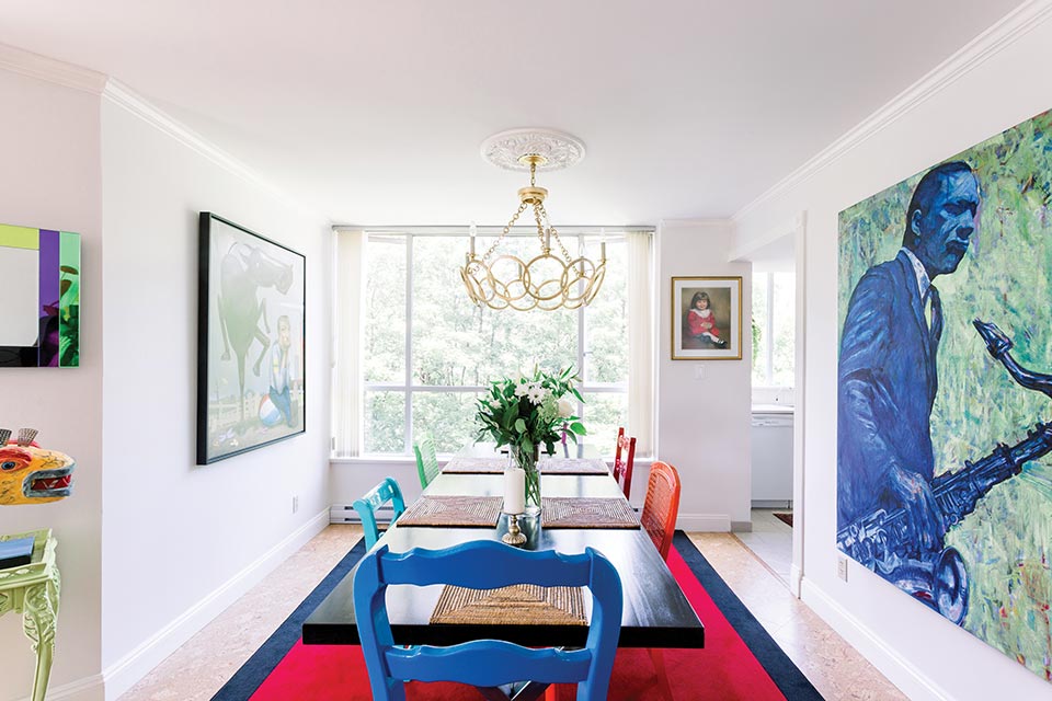
Though color can be tricky, and yes, downright daunting for many, don’t let it overpower you or your space. Take baby steps. We like to say the easiest and cheapest way to explore working with color is through the introduction of some accent pillows. This may translate to a throw blanket, perhaps a more colorful piece of artwork, and then a rug. But the larger the item, the less intense it should be, and vice versa (depending on the impact you want for your space). This will allow for some “rest and repeat” throughout the space, giving breath to colors while also limiting the “fearful aspect.” Especially if color is only introduced into the accent pieces in your home, they can be more easily replaced over the seasons and years while also presenting less of a financial risk or investment.
Q:
What pieces of décor do you find are the best to add color to a space? Blankets, pillows, rugs, artwork, curtains, accent furniture?
A:
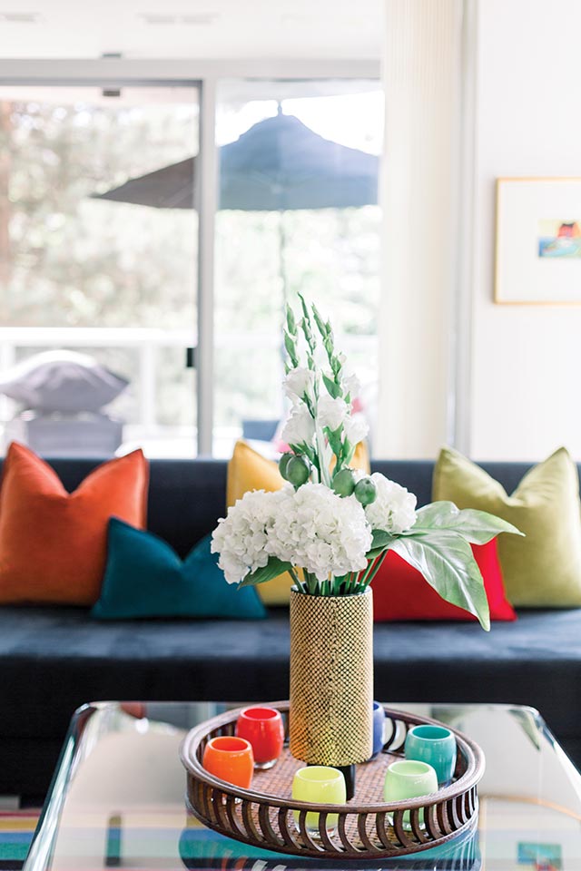
We use, love, and work with blankets, pillows, rugs, artwork, curtains, and accent furniture to bring color into any space. Ensure you base your color selections not on trends but on personal taste and preference. Don’t force yourself into a color simply because it’s been deemed “Color of the Year.” Surely we cannot help but find ourselves in these predicaments when we’re in the hands of retailers and suppliers who manufacture these goods for us, but base the purchase (whether on trend or not) on the emotion the color evokes for you and your space.
Color has been studied for centuries for a reason. Colors can emote and transmit certain emotions, reactions, feelings, and ambiances. So have color work for you, not against you. Consider your space, too. If you have darker or bolder walls, you may want to consider lighter and brighter accents to incorporate for contrast. Alternatively, if you maintain a light, bright, and airy foundation to your space, you may be seeking contrast on the other end of the spectrum, so look to deeper and bolder hues. Again, seek items easily accessible and that you can transform in later months or years.
Q:
For homes with several family members, how do you choose a color/colors that everyone will love?
A:
Start on common ground. Neutral colors and tones will serve everyone’s desires well. This could be taupe, gray, white, brown, etc. Once this common ground has been established, it then becomes easier to find objects, accents, and items within that base color that also introduce another accent color within. For example, this family home is mostly neutral in palette in the walls, flooring, and sectional. Let’s say, for instance, the palette ranges in a variety of light to dark grays. By finding rugs or pillows that have grounding in one of these gray tones, but then quietly introducing another accent color—such as a navy blue, perhaps in the border of a pillow or pattern of the rug—you’ve “broken the ice,” so to speak. Using this as the springboard to introduce a variety of blue accents within this family home will be much easier, such as a few complementary blue vases, candles, or paintings, allowing everyone to see eye to eye! In addition, we find blues, reds, and greens to be the simplest way to find an accent in “common ground,” and they are commonly quite accessible when it comes to shopping for the right accents.
Q:
What is your favorite way to start adding color to a room? Do you like to choose a piece of furniture with a fun print, or do you opt for neutrals and then add small pieces into the design?
A:
Finding inspiration for using color in a space can come from many things: a beautiful silk gown, a painting, or another piece of art you love. This can serve as your jumping-off point and provide you with the foundation necessary to build your room of color. Being inspired starts your journey into creating a beautiful and well-thought-out room. Sometimes, we cannot deny the heart, and we find the perfect accent chair or fabulous rug in the ideal color or pattern for the space, then use it as inspiration for the rest of the colors to follow. Although in most cases, we would be ideally limiting our largest pieces in the home to a neutral tone and color, then seeking our focal. In most, spaces this would be perhaps a wall covering or piece of art that is vertical, visual, and dominant in the space. Once we’ve found that fabulous covering or art, we can begin to pull tones, textures, and colors from this piece or pieces to be emulated in other areas and elements of the space.
Q:
What advice can you give on choosing colors that will stay timeless in a newly decorated space?
A:
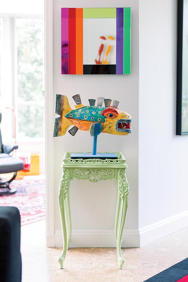
So, where do you start? Color has been proven to have psychological effects on people, so as you dive into the pool of paint swatches, ask yourself how some of your top color choices make you feel and how you want to feel in your space. The same room can have a completely changed ambiance in a new hue. For example, cool colors such as blues and greens evoke feelings of tranquility, reliability, and calmness. On the other hand, colors on the warm side of the spectrum tend to act as stimulants. Reds, oranges, and yellows are known to elicit feelings of excitement, warmth, and playfulness. Consider this when making your color choices.
Keep in mind that color resonates with different people in different ways. The short answer to the color quandary is this: it’s all about personal preference. If you love it, then it’s right.
We believe if you stay true to you, you can never go out of style. One of the most common hurdles we face in our profession as interior designers is our clients’ sheer fear of color. Honestly, we’ve heard it all: “It’s too bold”; “It’s too trendy”; “It’s too colorful.” To all those excuses we say, “You’re not afraid of color. You’re just afraid of the wrong color.”
Common mistakes we see in people’s homes are that they’ve purchased everything in the home adhering to that time period or the Color of the Year, which will quickly go out of style and not provide the longevity most desired. So whether there’s a little or a significant amount of color in the home, if you’ve maintained your personality and your style, your space will always reflect you and not the times. Though, like trends or seasons, we can certainly change or adapt our personal style over the years; therefore, also using color in a balanced and thoughtful approach, again such as in smaller or limited pieces in your home, will allow you the opportunity to more easily transform your space in the future.
Also, following our initial suggestion, a neutral or white palette in your space and on your walls will leave your space feeling bright, timeless, and always in style.
 Q:
Q:
When it comes to designing a home that has colorful inspiration, how do you unite the design throughout rooms within a home?
A:
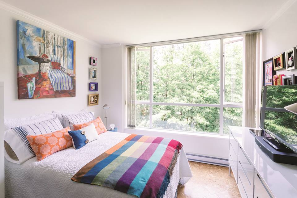
One of the most important factors of introducing color into any home is the use of repetition. Introducing it heavily into one space and then not another—or at all—will leave your home feeling unbalanced and appearing noncommittal. If you’re going to take something, we like to say, “Take it, run with it, and make a statement!” But find ways to introduce that color and tone respectfully into areas, adhering to their purpose and use. For instance, you may want to make a splash for impact in a foyer or powder room because these areas are more transient and allow the opportunity to take a larger risk in a smaller space. In contrast, for a bedroom, you may want to take a lighter hand and approach the introduction of color in more limited areas in a softer tone or hue of the same color.
 Q:
Q:
One of our favorite things about the summer is how the sunshine can truly bring brightness to a room with longer, sunnier days. Do you have any advice on how to achieve the same goal in every season?
A:
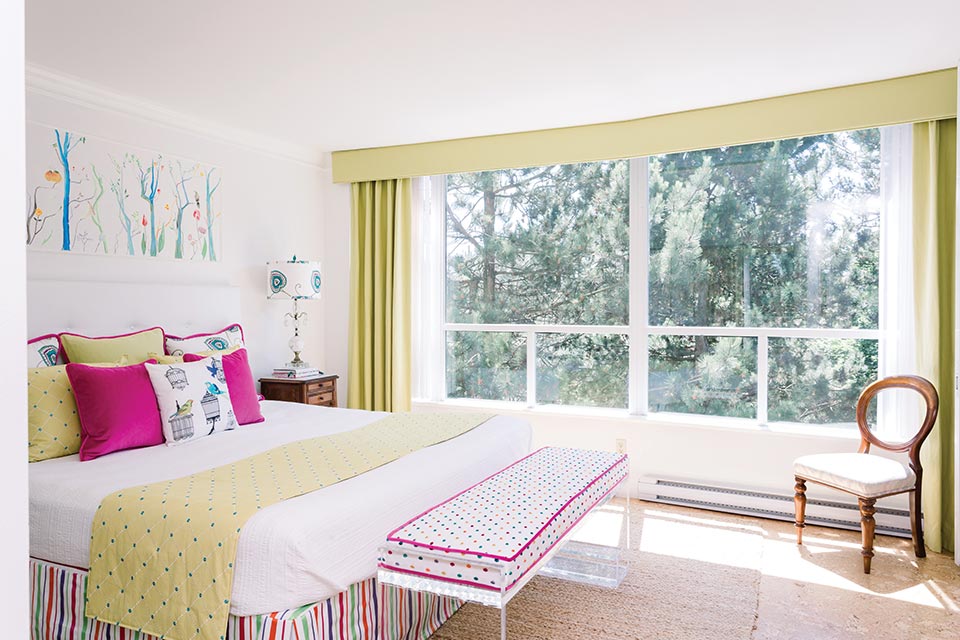
Again, maintaining an overall brighter and neutral tone for your base finishes, such as your floors and walls, will ensure you have a home feeling more like summer year-round. This allows you to take advantage of even the slightest rays of light we may receive over the fall or winter months by reflecting them off brighter walls. Drab and dark walls simply absorb those rays. While accounting for color, don’t forget about artificial light. Finding the right temperature of light and replicating it throughout the room in floor lamps, table lamps, and overhead lighting will create a cohesive and bright space that emulates those summer months.
PRO TIP: We like to opt for 3,000K temperature in our lights, which refracts into a perfect bright white that is not too yellow or blue, creating the perfect atmosphere, and most importantly, accurately reflecting the colors in the home.
Q:
Is there any way to ensure a foolproof color choice in a space when adding multiple design features? Should different shades be chosen, or is it okay to add several colors in one space?
A:
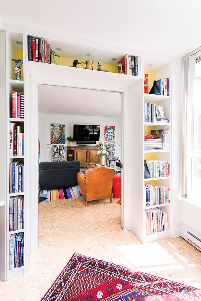
The world is truly your oyster, so whether using one or one hundred colors, it’s a matter of ensuring you stay true to yourself and your space. If working with just one color, simply introduce it into the space with a variety of tones and shades to create layers and avoid the look of a “one-trick pony.” If multiple colors are introduced, try to adhere to the same intensity of hue throughout those colors in the same shade so that you begin to complement all of the colors in the space, rather than presenting a discordant variety of shades and hues.
Advancing colors such as red, orange, and bright yellow will make a room seem smaller and more intimate. Blue, green, and violet are cool and soothing. In the right settings, colors can be mixed, coordinated, combined, and juxtaposed to create a contrast that pleases the eye and stimulates the senses.
Q:
We want to help create spaces that flow. Are there any huge design flaws with color that should be avoided from the very beginning?
A:
Be careful with accent walls, which can limit your space opportunities. Instead, opt for a wall covering that can still bring color into the space but with more interest through pattern and texture, and which will also act as art for your walls.
Q:
We love a space with tons of windows, light, and color. Is there any way to mimic this look in a home with fewer windows or doors, where there’s not as much opportunity for light to shine through the home?
A:
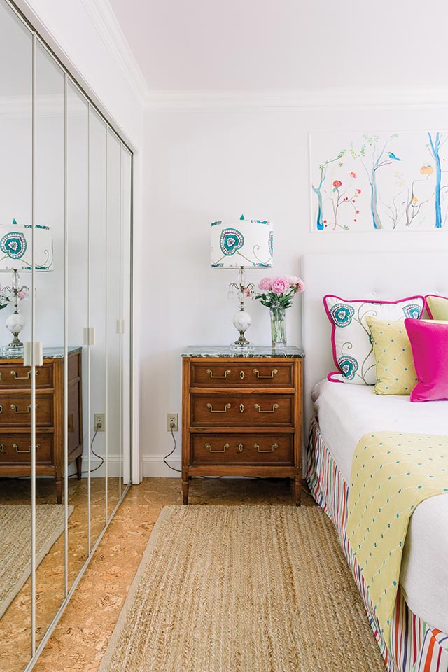
The easiest way to ensure you don’t go too far with a bold, colorful look where the space is smaller and dimmer is to maintain a neutral base. Light floors and white walls will always help balance the colors in the space. Then consider introducing the right levels of light into the space through ample artificial lighting, such as overhead fixtures, floor lamps, and table lamps, in the same color and temperature of light.
This will also ensure the space remains bright and that you perceive the accent colors in the space cohesively. Also, limit yourself to the items you introduce with color. In a larger and brighter space with ample windows, we may be able to be more adventurous with brightly colored accent furniture pieces; but in a smaller and darker space, you may want to consider these brighter colors in the rug, pillows, artwork, and even the shade of a lamp.
Q:
Are there ways to make a room feel more colorful without adding on to the texture of the space?
A:
Focusing on solid color introductions in your accents helps to reduce visual noise and texture in the space. Keep to accents without patterns or stick to color-blocked accents. A solid throw adds an accent, but a mix of two or three colored pillows in a complementary color will help to maintain a space limited of texture while bringing in some color.
Interior Design: KALU INTERIORS | Photography:PROVOKE STUDIOS
Award-winning interior designers Phyllis Lui and Aleem Kassam are the principal design duo for Kalu Interiors. For more than a decade , this Vancouver-based design firm has been creating thoughtfully curated interiors that enhance and inspire how you live.