Designer Q and A on Timeless Bathroom Designs
Oct 06, 2020 | Carpet One Floor & Home
From the Fall issue of Beautiful Design Made Simple magazine, Korina Khamis of Hibou Design and Co. shares insights on how to achieve a timeless bathroom design.
Who is the Client?
The client is a professional couple who recently are in the process of downsizing. They were looking to reduce their commute time and decided to move to another area of the city. They live with their older son, and their daughter.
Tell us a little about each bathroom.
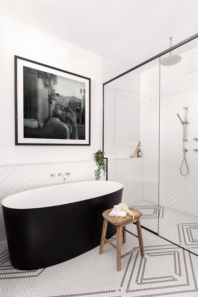
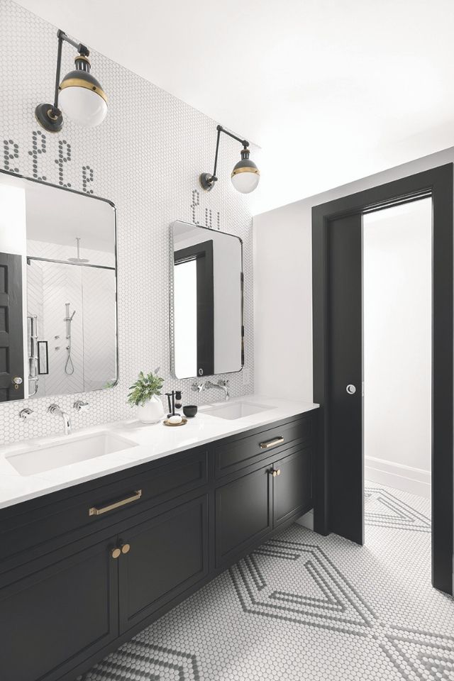
The master was a really quirky space initially, it only had a cabinet that was 12” deep and a huge tub that swallowed the entire space. We decided to take over the walk-in closet beside it to enlarge the overall footprint. Some of our main factors in the design was allowing the light from the skylight to flow through the entire bathroom as well as accommodate a large Italian style shower. Whenever space allows, my favorite feature is to add a water closet so that a couple can easily use the space together. This bathroom has a fun edgy vibe just like our client. I really felt like we were able to design a space that spoke of her as she has a great personality and overall fun design aesthetic.
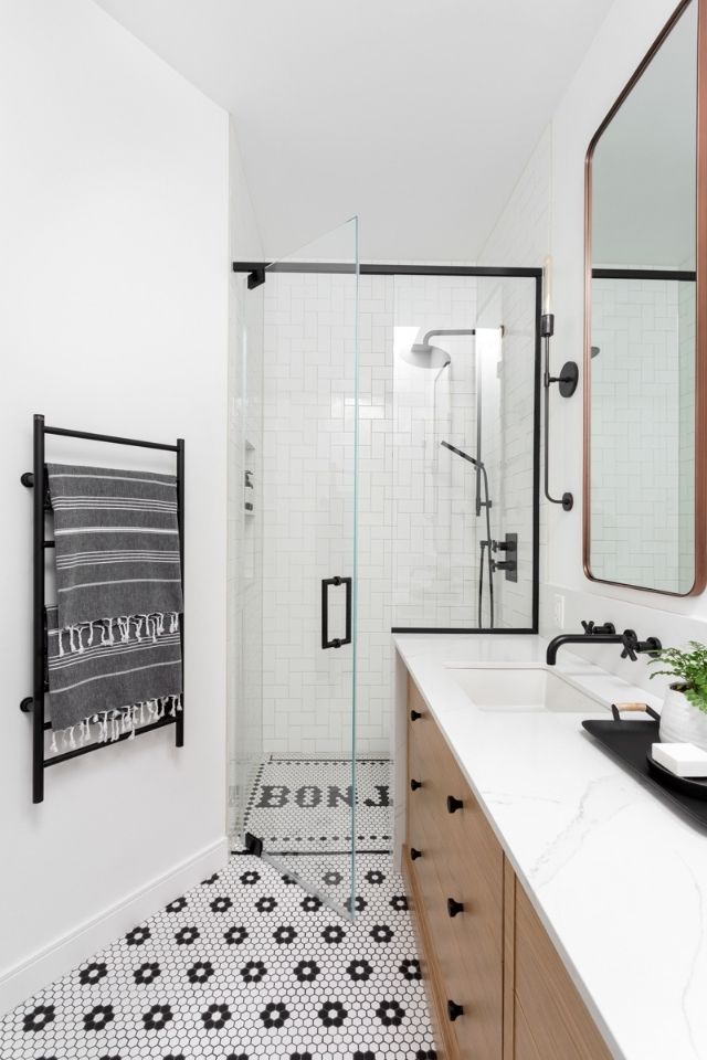
The intention with the kids’ bath was to have a fun bright space. The main shot of the vanity is also the first thing you see as you come up the stairs. I wanted to be certain that while the door remains open (since kids will not close it 90% of the time) you had a beautiful space to look at, the sun from the joined skylight is so inviting. We made sure that the toilet and shower would be tucked out of site so you can really focus on one element.
What were your clients’ needs for the two spaces?
Storage, storage, storage! Main concerns were that the bathrooms in the home were extremely out of date and not functional at all. Cabinetry was only 12” deep and overall bathroom had not been renovated for decades.
Were there any challenges you faced during the design process?
This home came with a very complex layout with multiple angles throughout each space. The biggest challenge was being able to accommodate two full bathrooms while sharing a skylight and incorporating a large walk-in closet.
What’s one unique element in each bathroom and what was the inspiration for each?
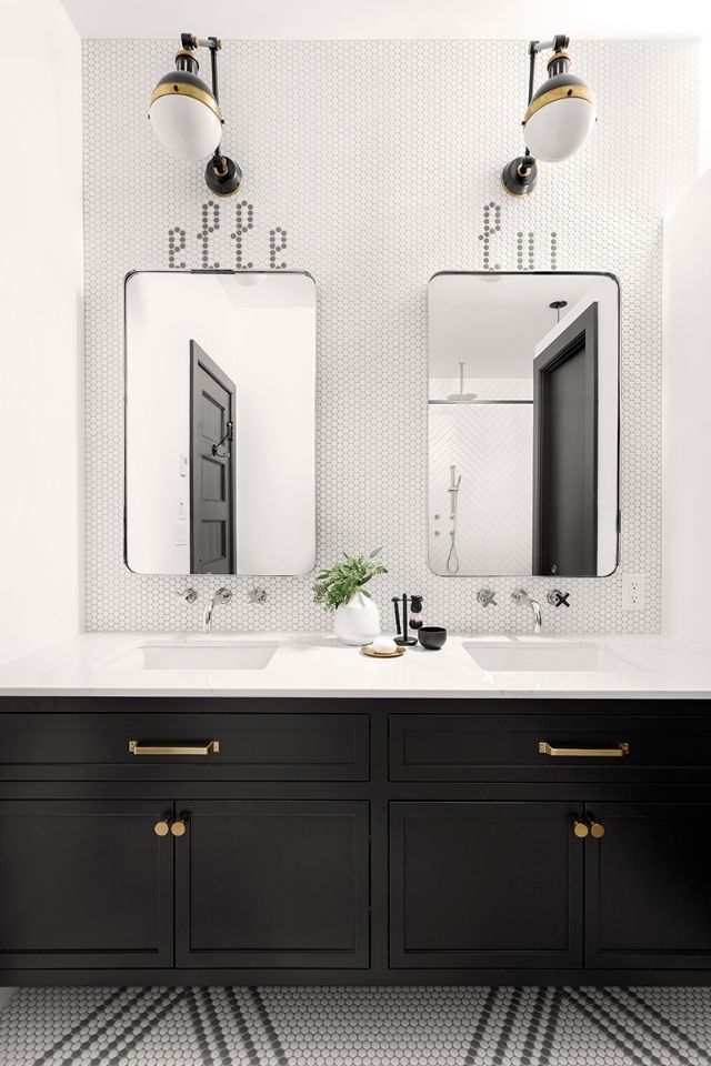
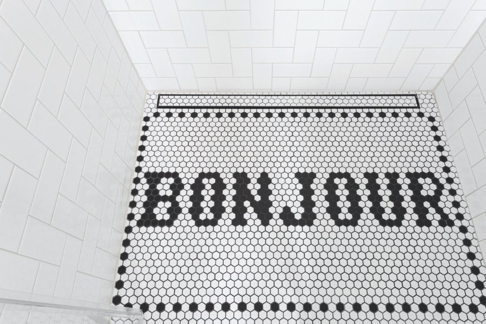
Tile inlays. In the master bathroom we built a his and hers vanity labelled with “Elle” and “Lui” over each sink in the penny tile installed on the wall. We also incorporated the word “bonjour” in the kids shower which repeated the theme in the master bath.
The clients’ inspiration pictures included lots of bold cement tiles as well as some more traditional penny tile designs. I wanted to up that a notch by creating a custom tile pattern that would incorporate the traditional aspects of a penny tile with a modern and bold pattern. It took some time, but we finally were able to come up with a pattern that was a perfect scale for the room and allowed for a perfect alignment/symmetry to the vanity and shower.
As for the kids’ bathroom, I would opt for the drawer fronts as being one of my favorite elements. Instead of a typical shaker we had a custom panel designed that allowed the shaker trim to continue through the drawers. I kept it very thin which was also a nice way to compliment and modernize the retro feel of the floor pattern.
Do you have any special considerations or requirements when creating a bathroom?
Storage and lighting are a must to creating a functional bathroom! We split the bathrooms strategically to allow the natural light from the skylight to come into both spaces, and by leaving the water closet wall a little shorter the entire ensuite was able to benefit. We also made sure to layer the lighting throughout both bathrooms. We also incorporated lots of storage in both spaces, the kids’ bathroom had an extremely long vanity, while the master was able to have recessed medicine cabinets.
Speaking of lighting, the fixtures are so unique! Can you speak to your selection process?
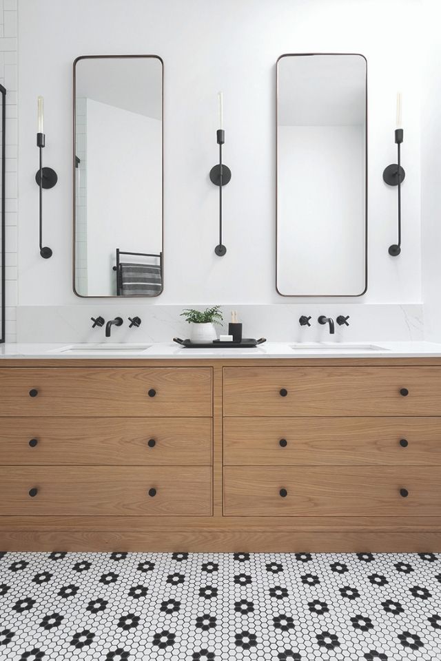
I opted for long thin sconces to anchor the mirrors and really emphasize the ceiling height. Part of the sourcing was to stick with thin and understated lighting so that the bathroom would not become too overwhelming with such bold design features.
The Master Bathroom lighting needed a bit of arm twisting for the husband, they definitely were not cheap but really was the element to help pull all the design together. I wanted a sconce that would hang off the wall to highlight the words over the vanity. Again something that would accentuate the height of the ceilings and warm up the bathroom with small brass elements. Having such a monochromatic scheme can easily become cold especially in a bathroom since there are such few opportunities to incorporate warm textures. The small brass details in the lighting and hardware was just enough to bring warmth, but avoid a gaudy palette.
How does the flooring play into your design?
The floors! We spend hours working on a custom tile pattern that would perfectly align to the vanities and shower. Ensuring the scale and proportions were perfect took a lot of concentration and we actually tiled a to-size sample, grouted and all. We used a mosaic penny tile in both bathrooms, with different unique patterns.
One of the main deciding factors in the tile selection was the architecture and age of the home. I wanted to have classic design elements with a twist that related to the clients aesthetic and personality. Penny and subway tiles really helped me achieve my goal. They are so universal and able to morph into any aesthetic, the traditional floral pattern played well with a 90 degree herringbone in the shower and the playful “Bonjour” insert in the shower.
I also incorporated a traditional herringbone pattern on the master walls, but with a more modern subway size. I purposely kept the grout light so that the pattern on the floor would take center stage.
Why did you choose these colors?
We wanted the overall aesthetic to feel bold yet timeless, so that it would suit the architecture of the home. Westmount is known for homes with good bones and great architecture. Ie; high ceilings, original plaster trim etc. So we opted for classics, whites, black and natural wood tones.
Let’s talk finishes. What types did you choose for each bathroom and why?
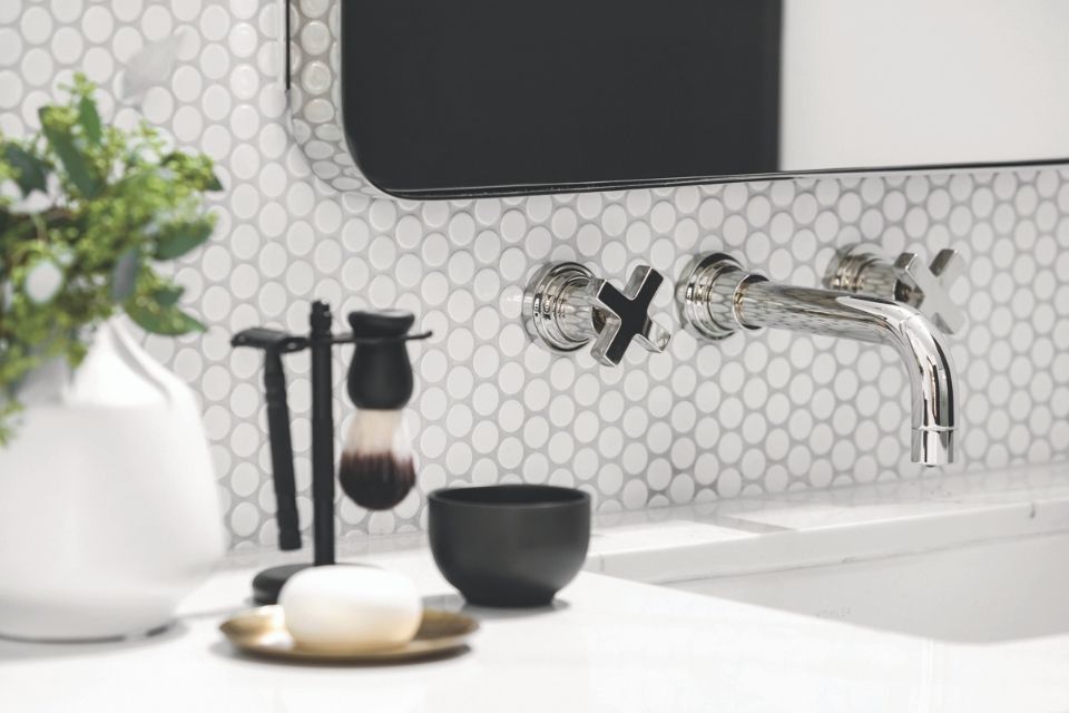
Each bathroom had a similar color scheme with classic black and white tiles and finishes. I chose to warm up the kids bathroom with a wood vanity, brass framed mirrors that complemented the tone of the wood and counter that has some warm caramel veins. Classic cross knob handles also downplayed the edgy black plumbing fixtures. The master bathroom all started with the tub that I just fell in love with! I wanted it to be a more sophisticated space with an edge. So I opted for a black vanity, I left it floating so that the pattern can continue beneath it and act as a mat to each individual sink. It was also important to me to keep the metallic finishes warm which I achieved by incorporating brass and pairing that with polished nickel.These bathrooms have a perfect design to compliment the rest of the clients’ home, she has a really fun space and I wanted to carry that through.
What did your client like the most?
This was a unique situation as the client is also a decorator. We were first worried about how this client relationship would play out and be given creative freedom for the project. However, the clients were really happy with the final esthetic and functional storage provided, and absolutely loved the unique personal elements we were able to incorporate.

About the Designer
Korina Khamis is co-owner of Hibou Design & Co., a full-service interior design company. Korina's unequaled attention to detail ensures that no corner of any home is unused. Combined with her enerring eye for colors, shape, and texture, the designer is known for creating charming, warm interiors.