Designer Q and A with Diana Rose
Jun 17, 2021 | Carpet One Floor & Home
Diana Rose takes us behind the scenes of a multi-level home where she transforms the kitchen, living room and breakfast nook into a stunning open concept space that flows naturally for optimal function.
What were your overall needs for this space?
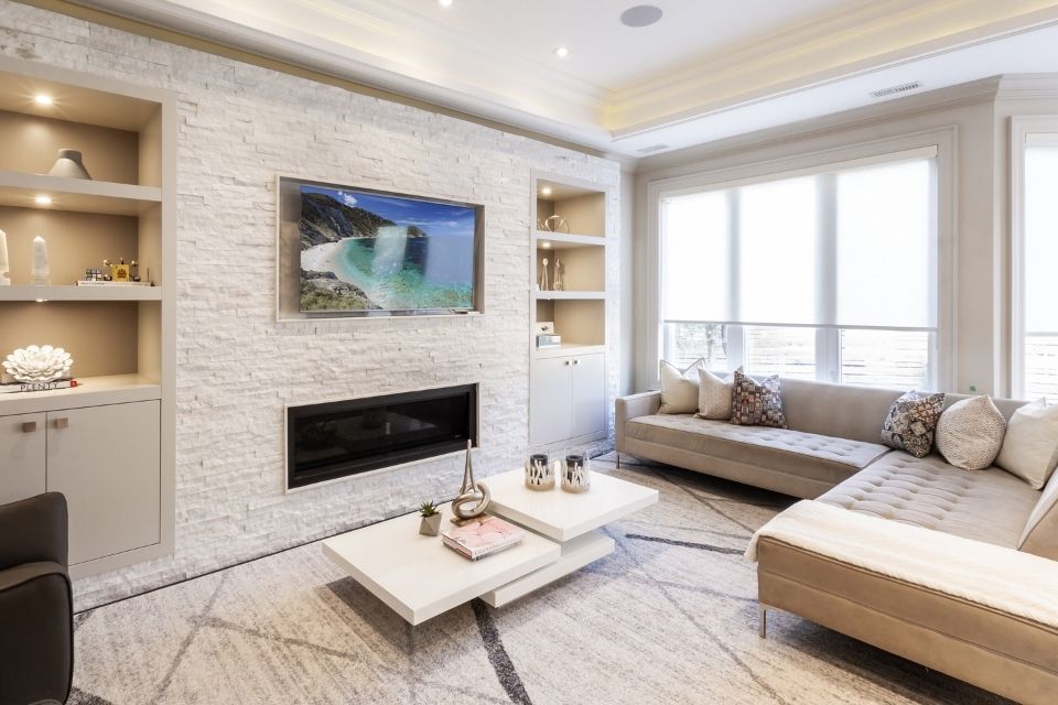
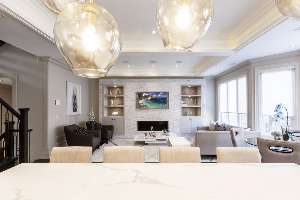
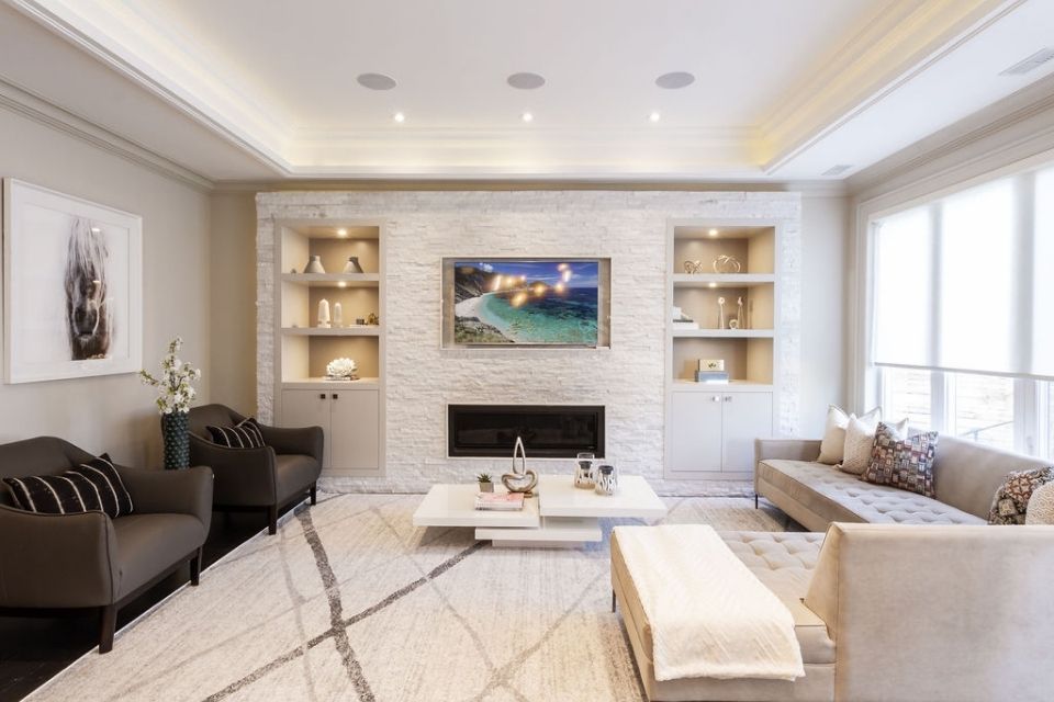
For this multi-level home, this particular space was the heart of the home, which shared the kitchen with the family room and breakfast area. After all, this is where the most time is spent! It needed to be comfortable for the client’s daily lifestyle yet compliment the overall flow of the home. The wall unit needed to incorporate a niche for a TV and a linear gas fireplace below with tons of storage on each side of the unit, both hidden and open.

Were there any challenges designing this space?
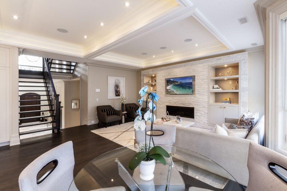
There was a huge mechanical shaft on the corner of the wall. To make it seamless with the space, we built a faux column on the opposite side to camouflage the shaft and make the wall unit opening symmetrical with the room. Also, since this room was not as deep as desired, we sunk the side cabinets into the wall to avoid protruding cabinetry. The other challenge was that the family room is directly opposite the kitchen area. Although this is a good idea conceptually, when placing furniture, this creates a problem with the position of the sofa. Ideally, for comfort, the couch should be facing the TV, which in this case would “block” the open flow between the kitchen where you would see the back of the sofa. Having the room so shallow was also not easy, so we opted for a sectional with a chaise facing the sofa.
Did you have any special considerations or requirements when creating the room?
This project was a smart home, so we had to design the cabinetry and ceiling with integrated smart lighting and speakers. The lights were both LED and Puck lights set at different scenes, with subwoofers and speakers built-in.

How does the flooring play into your design?
Because this room is shallow and also open to the floating staircase and kitchen, we kept the hardwood floor throughout to make the space feel more seamless. We opted for site-finished oak hardwood floors stained with custom stain color in a satin finish. All floor registers were also custom-fitted. We also added a large rug to visually make the space feel bigger.

Why did you choose the colors used in the space?
This space is quite open and is flooded with natural light due to large windows. So we wanted to carry this airy color palette throughout. We even matched the cabinetry with the kitchen on the opposite side to make it cohesive. We also introduced some subtle punches of pattern from other cultures, such as Portugal and South Africa. The open shelves were also lightly accessorized to avoid too much visual clutter.
What is your favorite aspect of this project?
I would say the “integration” of every detail: from architectural elements such as vaulted ceiling and cabinetry to lighting, flooring, and choice of color.

What materials used echo some of the design trends for 2021?
Natural materials that are textured. This room has so many to offer, from natural stacked stone to polished marble to organic hardwood floor to plush carpet and cushions.
Interior Design by: Diana Rose
Diana Rose is the Principal and Creative Director for Diana Rose Design. Known for creating tailored interiors that enhance and complement your lifestyle, she serves clients in Toronto and GTA.
Keep up to date on current trends, and get inspired by the best! Visit our, Beautiful Design Made Simple blog, for helpful design advice from experts.